Beeswarm plots in Python
CommentsIntro
I have recently migrated all of my plots from R to matplotlib. One cool plot type that I was missing from R was the beeswarm. I tried searching for some Python solutions (some discussion on this can be found here and other places online) but was not satisfied with anything I found (if anyone knows of a good implementation out there, I'd be happy to know about it). I made a simple Python implementation of beeswarm, drawing heavily off of the R beeswarm code. This is available as a python package: https://github.com/mgymrek/pybeeswarm. This was whipped up pretty quickly so it is by no means complete. See wishlist at the bottom.
Note, the code for this IPython notebook can be found here. Also available on nbviewer.
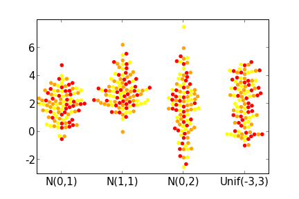
Here's an example before we get started:
Install
To install, simply do:
git clone https://github.com/mgymrek/pybeeswarm.git

cd pybeeswarm

sudo setup.py install
To test that it worked, open up python and check that import beeswarm doesn't give you any errors.
Basic usage
There is only one function, beeswarm:
from beeswarm import *
help(beeswarm)
Here's a small example:
from beeswarm import *
import matplotlib.pyplot as plt
import numpy as np
d1 = np.random.uniform(low=-3, high=3, size=100)
d2 = np.random.normal(size=100)

bs, ax = beeswarm([d1,d2], method="swarm", labels=["sample 1", "sample 2"], col=["blue","red"])
Examples
Here I show what the plots look like for the same examples given on the R beeswarm page for comparison.
Comparing arrangement methods
from beeswarm import beeswarm
import matplotlib.pyplot as plt
import numpy as np

d1 = np.random.uniform(low=-3, high=3, size=100)
d2 = np.random.normal(size=100)

fig = plt.figure()
fig.set_size_inches((8,8))
ax1 = plt.subplot(221)
ax2 = plt.subplot(222)
ax3 = plt.subplot(223)
ax4 = plt.subplot(224)
axes = [ax1, ax2, ax3, ax4]
methods = ["swarm","center","square","hex"]
for i in range(len(axes)):
    beeswarm([d1, d2], col=["black","red"], method=methods[i], ax=axes[i], labels=["Uniform","Normal"])
    axes[i].set_title("Method: %s"%methods[i], size=15)
plt.tight_layout()
Specifying colors
You can specify one color for everything, one color per group, one color per point, or cycle through colors, given by the four examples below:
fig = plt.figure()
fig.set_size_inches((8,8))
ax1 = plt.subplot(221)
ax2 = plt.subplot(222)
ax3 = plt.subplot(223)
ax4 = plt.subplot(224)
beeswarm([d1,d2], method="swarm", labels=["Uniform","Normal"], col="black", ax=ax1)
beeswarm([d1,d2], method="swarm", labels=["Uniform","Normal"], col=["black","red"], ax=ax2)
def GetColor(x):
    colors = []
    for item in x:
        if item > 0: colors.append("red")
        else: colors.append("blue")
    return colors
colors = GetColor(d1) + GetColor(d2)
beeswarm([d1,d2], method="swarm", labels=["Uniform","Normal"], col=colors, ax=ax3)
beeswarm([d1,d2], method="swarm", labels=["Uniform","Normal"], col=["red","blue","orange"], ax=ax4)
plt.tight_layout()
Conclusion
There are several features that the R package has that I didn't implement here:
- "Corral" methods that keep the data from spreading too far horizontally
- The ability to do horizontal vs. vertical plots
- The ability to take in formula objects, just as R methods such as boxplot, lm, etc. take. This can be done in Python using patsy, but I am not very familiar with the package yet so I didn't venture there.
If I come across the need to use these features, (or if anyone would like to add them...) it might happen in the future. For now, I hope those of you missing this package from R will find this useful. Let me know if you have any feedback. Happy plotting!